Whilst constructing my Digipak, I decided to experiment with a lot of different effects and styles using various tools in Adobe Photoshop to create my desired effect. Below are a series of different trials I made during the construction of my final product.

Above I have simply added a red colour filter over my original image, however I felt that the tone of red I used was far too bright and wasn't 'dark' enough to have parity with my video.

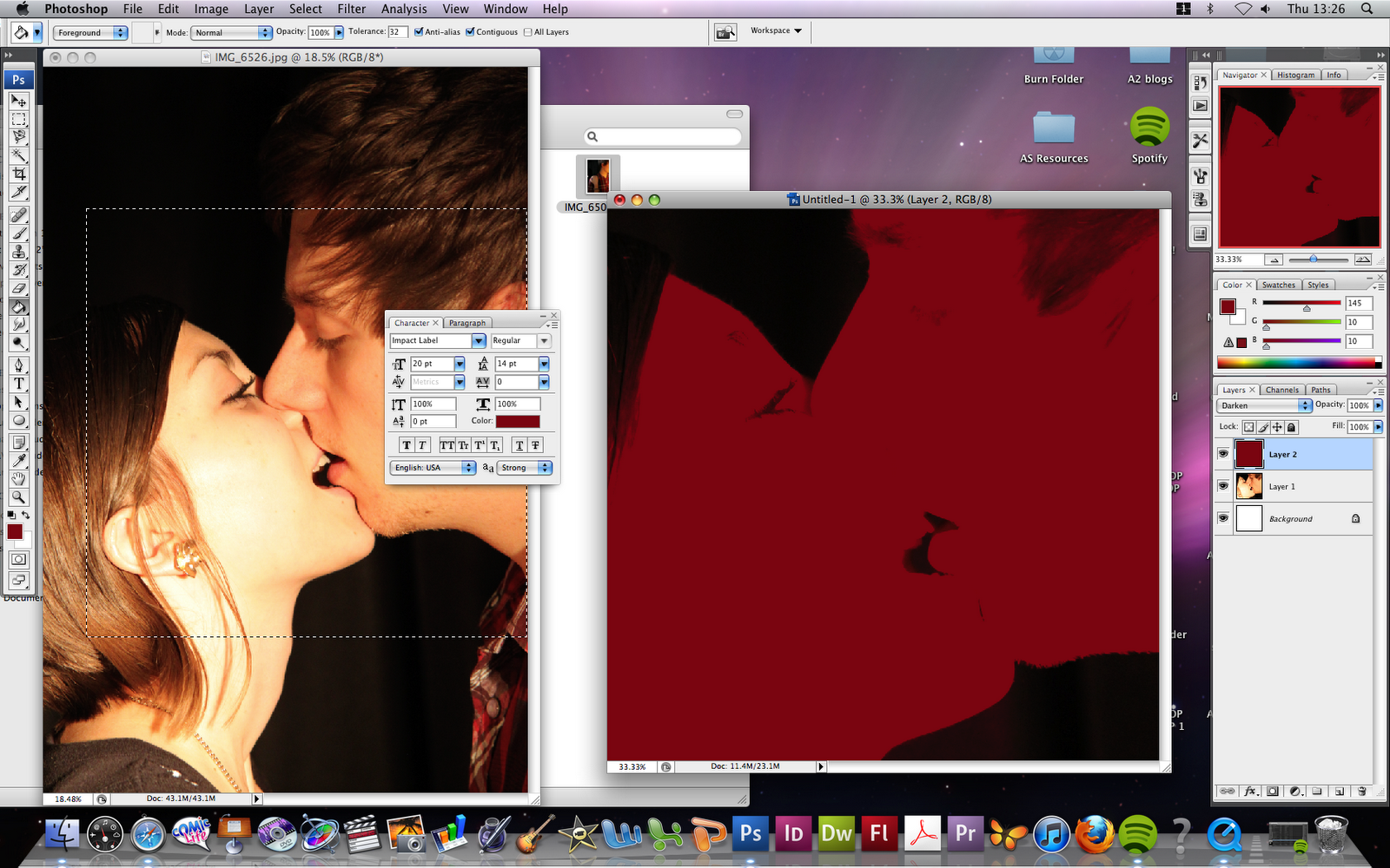
Above I used a different shade of red along with a different filter to create a much darker and less romantic edit of the image, which I feel worked successfully, however ultimately was too simple to be used as a front cover, and did not offer enough impact.

Here I started to experiment with adding overlays to the image, this one being Halftone>> Dots. I felt that this took away the impact of the image even further due to the fade that it applies to the image.

This image was created using the same Halftone overlay atop the dark red filtered image, however this time I used Halftone>> Lines, and felt that this created a perfect balance of dangerous and sinister appeal to represent my product, with the scan lines offering an almost voyeur depiction of the image, as if it were being viewed through a surveillance camera etc. This is also the image that I decided to ultimately use as the front cover panel of my product.

I used the same Halftone overlay here, however this time choosing Halftone>> Circle. This ultimately became a close contender for the front cover of my product, however I felt that the toned down colours took away the appeal and impact that the final image created.

Here I began experimenting with filters again, this time using the exclusion filter atop a bright red one, I felt that this image seemed too 'sweet' and romantic however, and almost looked as if it would be chosen to represent a pop music product rather than the genre that I am representing. I began to experiment with text as well with this one, choosing alternate colours for each title to differentiate between them.
Other experiments I undertook:


I also experimented with other typefaces for my front cover, including this billboard-esque font, however decided against this in the end, opting for the more structured and less distracting font, Bebas.

Below is my final front cover panel, which I feel exudes a sinister, dangerous and sexualised tone, which is everything I hoped for and required it to do to retain parity between the product and my video.

After creating my front cover, I did not need to experiment as much when creating my back cover, as I already knew how I wanted it to look and how to achieve the look and feel I was after. I used the typeface Impact Label to display the tracklisting, and ultimately feel that the front and back covers of my digipak achieved parity between themselves. Below is my final back cover panel.

No comments:
Post a Comment