Sunday 23 January 2011

Construction of Digipak: Magazine Advertisement

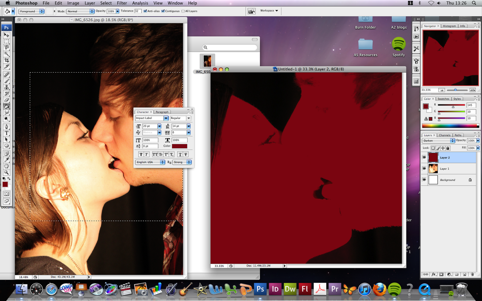
When constructing my Magazine Advertisement to promote my digipak, I wanted the advertisement to have a great parity with the digipak, due to fact that that is what is is promoting. As a result of this I decided to use the original image from my front cover of my digipak for my advertisement, edited in the same way. I began by taking the same steps with the larger, less cropped image as I did to edit the front cover of the digipak, by first adding a dark red filter.


I did however look at possibly using the Halftone>> Circle overlay at one point, due to the fact that I wanted to feature my digipak cover on my magazine advertisement, I later decided against this however due to the fact that I felt that it affected the contrast too much.


I decided to use the Halftone>> Lines overlay, the same as on my front cover, and had, at the time scrapped the idea of putting the digipak cover on the advertisement. I then began adding text, in the same typeface as my digipak, Bebas. I experimented with the content of the text, and how much I wanted the advertisement to say as well as fit in with currently existing magazine advertisements for the same purpose.


I later began to feel as if the magazine advertisement didn't advertise the actual digipak as much as it should do, and that it was unobvious at first glance that the advertisement was promoting the digipak. I also felt that there was too much unattended space where the focus of the image was, and this created a loss of impact. Due to this I added a picture of the digipak cover, imposed onto the image as if it were still a part of it, however still deterring from it and differentiating the digipak from the advertisement by offsetting it from the image slightly, and adding a black border and drop shadow. I feel that this worked extremely successfully and advertises the digipak in a way that pushes the conventions of magazine advertisements for digipaks/ cds slightly in its composition. Below is my final Magazine Advertisement in promotion of my Digipak.

Saturday 22 January 2011

Construction of Digipak: Inside Panels

The first inside panel I began working on was the inside flap, that would be seen after first opening the digipak, alongside the first of the inside panels that include the disc. Below, some of the experiments I did can be seen.


My decision fell between the final two, as the first of the two had more parity with the outside panels, which is where it would be seen when presented as my final product, but I felt that there was a stronger need to create parity between the two inside panels rather than the inside panel with the two outer panels, due to the fact that, once opened as an actual product, the two outer panels would not be seen at all. Due to this I decided to use the second image for the initial inner panel.

Here I began to construct the three inside panels that would include the disc, with the intention of creating a stretched and distorted image,  with the influence of Grace Jones - Corporate Cannibal being an inspiration to me. After several trials that can be seen below however, I decided against this due to the less serious and fairly comical outcomes that resulted.


Instead I opted for a more simplistic approach, using simple dark red overlays over close up sections of my original images. Below is my final composition of this.


I later began working on the actual disc art, which would feature in the centre panel of the above three. I began by using the template shown below.


I then took the basic circle shape and imported my image, this allowed me to then experiment with overlays, filters and other effects to create my desired effect. I decided to stick with the dark red filter for this, as I felt that this would create a stronger parity with the rest of the product, however I experimented with changing the image in some way, with effects or overlays, to give some differentiation between the panels of the digipak and the actual disc. Examples of this can be seen below.


After figuring out how I wanted the image to look, and importing it into my final product, I began to look at and experiment with adding text to the disc art, I first looked at creating an arc with the text, so that the titles would snake around the outer edge of the disc.


I later decided against this however as I didn't feel it looked professional enough or made enough of an impact due to the lack of strength that the type showed, and so opted for a more simplistic approach, that also flowed better with the front cover of the digipak, as can be seen below.


The final inside panels can be seen below also.


Friday 21 January 2011

Construction of Digipak: Front and Back Cover Panels

Whilst constructing my Digipak, I decided to experiment with a lot of different effects and styles using various tools in Adobe Photoshop to create my desired effect. Below are a series of different trials I made during the construction of my final product.


Above I have simply added a red colour filter over my original image, however I felt that the tone of red I used was far too bright and wasn't 'dark' enough to have parity with my video.


Above I used a different shade of red along with a different filter to create a much darker and less romantic edit of the image, which I feel worked successfully, however ultimately was too simple to be used as a front cover, and did not offer enough impact.


Here I started to experiment with adding overlays to the image, this one being Halftone>> Dots. I felt that this took away the impact of the image even further due to the fade that it applies to the image.


This image was created using the same Halftone overlay atop the dark red filtered image, however this time I used Halftone>> Lines, and felt that this created a perfect balance of dangerous and sinister appeal to represent my product, with the scan lines offering an almost voyeur depiction of the image, as if it were being viewed through a surveillance camera etc. This is also the image that I decided to ultimately use as the front cover panel of my product.


I used the same Halftone overlay here, however this time choosing Halftone>> Circle. This ultimately became a close contender for the front cover of my product, however I felt that the toned down colours took away the appeal and impact that the final image created.


Here I began experimenting with filters again, this time using the exclusion filter atop a bright red one, I felt that this image seemed too 'sweet' and romantic however, and almost looked as if it would be chosen to represent a pop music product rather than the genre that I am representing. I began to experiment with text as well with this one, choosing alternate colours for each title to differentiate between them.


Other experiments I undertook:


I also experimented with other typefaces for my front cover, including this billboard-esque font, however decided against this in the end, opting for the more structured and less distracting font, Bebas. 


Below is my final front cover panel, which I feel exudes a sinister, dangerous and sexualised tone, which is everything I hoped for and required it to do to retain parity between the product and my video.


After creating my front cover, I did not need to experiment as much when creating my back cover, as I already knew how I wanted it to look and how to achieve the look and feel I was after. I used the typeface Impact Label to display the tracklisting, and ultimately feel that the front and back covers of my digipak achieved parity between themselves. Below is my final back cover panel.


Thursday 20 January 2011

Construction of Film: Adobe After Effects

I also used Adobe After Effects in the construction of my film. Here are some examples of where and how I used the software.


Here is the file I needed to edit using Adobe After Effects. I used the remove grain tool and the strobe light effect to create a better quality piece of footage for my final video.


Here you can see the equalizer settings for each of the effects I used in Adobe After Effects, as you can see everything has been carefully tweaked to perfection.


Here is an example of the Adobe After Effects file, edited and placed on my timeline in my main video. Using After Effects meant that rendering was required extremely frequently due to the heavy level of editing that took place in the program.

Construction of Film: Adobe Premiere Pro

To edit my film I used Adobe Premiere Pro to create the main body, this consisted of a lot of use of the vast array of tools available in the software.


Here I have used the cross dissolve transition in Adobe Premier Pro, for a prolonged period of time, the transition is simply put into use by dragging and dropping to the desired area, and here I used it to create a montage scene, to portray a longer period of time than the timing in the video allowed me.


Here is an example of the amount of layers of film I used in Premiere Pro to edit with, using this number of layers allowed me to quickly realize which take of a shot would work best, and also allowed me to cut tightly to the end of the last clip.


Here is the audio timeline, before I had layed down any footage, as you can see Premiere Pro gives a clear visual representation of the audio track and where different parts of the song come in and out.


Here I used a transition called additive dissolve, which is basically a brighter version of cross dissolve, offering a bright glare as it transcends.


Here I played around with effects, to see just what I could do with the program, I did not use this effect however, but figuring out what was possible in the program was a crucial part of the construction ofmy video


Here, again I played around with effects, however did not use this one either.


Here is an example of me rendering my file. It was important for me to do this frequently as otherwise the program ran slowly and had trouble matching visuals to audio.


Here you can see me playing around with the speed of footage, speeding this shot up slightly so that it would fit in better with the beat of the song.


Using the cross dissolve transition some more...


Here I used the luma key tool to give the image a much darker and dirtier feeling to what I was able to do in real life, I feel that this worked well and was crucial to maintaining the look I wanted for my video.


Here you can see another example of me using the layers of video to my advantage, allowing me to find and maintain the right placing for my footage.


Here, at the end of my video I am using the fade to black transition to give the ending of the film a sense of closure.


Here are the main tools used in Adobe Premiere Pro, the select, grab and cut tools being the only ones that I really used. The cut tool is used to cut footage wherever wanted, slicing files in two at the desired point. The select tool is used to select this footage before, and the grab tool is used to move footage around via the use of drag and drop.